Reading a Lighthouse report, screenshot by screenshot
No prior technical background assumed. Every acronym gets defined the first time it shows up.

No prior technical background assumed. Every acronym gets defined the first time it shows up.
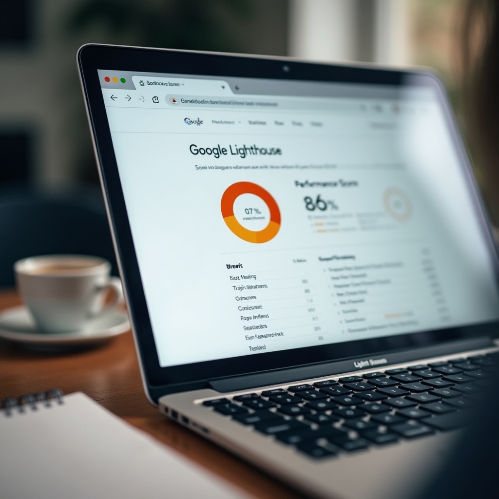
Walkthrough 01
That number between zero and one hundred is a weighted composite of several timing metrics, run under simulated conditions rather than against your actual visitors. It's useful as a rough gauge and unreliable as a precise grade. Two pages can score identically for entirely different reasons, one struggling with images, the other with third-party scripts.
The score also shifts run to run, sometimes by several points, simply because of small variations in network simulation or the machine running the test. Treat it as a compass, not a report card. The sections below the score are where the useful detail actually lives.
Walkthrough 02
Largest Contentful Paint measures how long it takes for the biggest visible element, often a hero image, a headline, or a background photo, to render on screen. Lighthouse will usually highlight which specific element it identified as the "largest" one, and that detail matters more than the millisecond count attached to it.
If the flagged element is a decorative background image nobody actually reads, the fix is straightforward: load it later or compress it further. If it's the main headline text, the fix usually points somewhere upstream, at render-blocking resources delaying the whole page.

Walkthrough 03
These two metrics both point at the same underlying issue from different angles: the browser's main thread being too busy running scripts to respond to a tap or click right away. Total Blocking Time is a lab estimate. Interaction to Next Paint is measured from real visitors and has become one of Google's core field metrics.
A page can look finished, images loaded, text visible, and still feel unresponsive if a button doesn't react for a few hundred milliseconds after being tapped. That gap is what these two metrics are trying to catch.
Walkthrough 04
Cumulative Layout Shift adds up how much visible content moves around after it's already rendered, usually because an image, an ad slot, or a font swap arrives late and pushes everything below it. It's the metric behind that familiar frustration of tapping a button just as the page shifts and hitting something else entirely.
Lighthouse usually names the specific elements responsible, which makes this one of the more actionable sections in the whole report. Reserving space for images and ad slots ahead of time resolves a large share of layout shift complaints on its own.

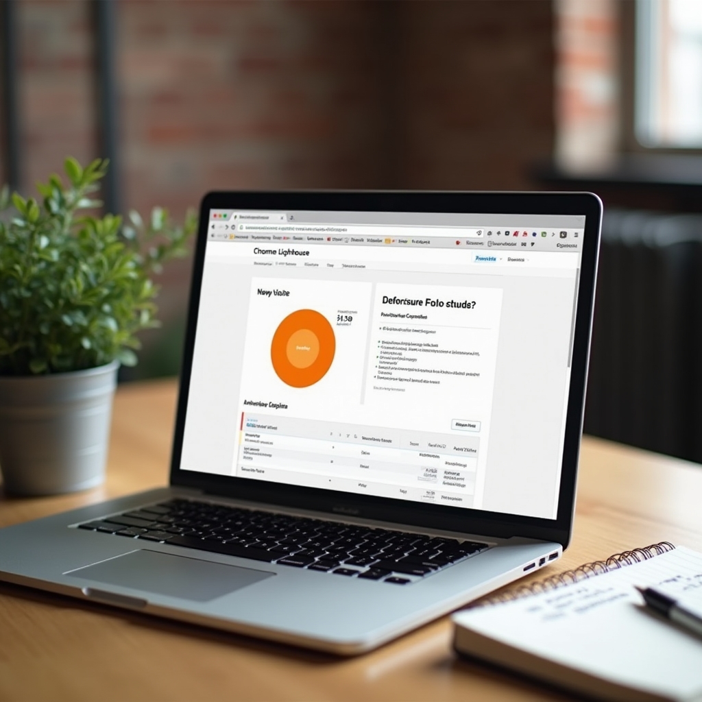
Walkthrough 05
Everything under Opportunities comes with an estimated time savings, which sounds precise but is really a rough simulation. It's a reasonable way to sort a long list, but it shouldn't be read as a guarantee. A recommendation estimated to save four hundred milliseconds might overlap heavily with another one on the same list, so fixing both rarely adds up the way the numbers suggest.
The Diagnostics section below it is more descriptive than prescriptive. It's worth reading in full at least once, mostly to build a sense of what the report is actually paying attention to before deciding what to act on.